Every August, the same thing happens. Small business owners start planning their busiest quarter of the year. New campaigns are getting mapped out, new offers are rolling out, and content calendars start filling up fast. Some business owners are even running ads for the first time.
There’s a real energy shift that happens in these few weeks. Summer winds down, everyone comes back from vacation, and it feels like the whole small business world turns its attention toward Q4.
But here’s what gets missed almost every single time. Business owners spend all this energy planning how to bring people to their website, and almost none of it checking whether the website is actually ready to hold up once they get there. That’s exactly what a fall website audit is for, and it doesn’t need to take more than twenty minutes.
Below are the three things worth checking before you spend another dollar or hour of effort this fall, whether you’re launching paid ads for the first time or simply stepping up your marketing plan for the season.
Do Your Calls to Action Match What You’re Actually Offering?
This one sounds obvious, but it shows up constantly. Small businesses change their pricing, their packages, and their focus throughout the year, sometimes every quarter. What you were promoting last January isn’t always what you want to promote this fall. But the buttons on your homepage, the links in your navigation, and the calls to action across your site don’t always get updated at the same pace your business does.
Here’s how this tends to play out in real life. You raise your prices, but the testimonial on your sales page still references the old number. You add a premium tier, but your homepage button only links to the entry level offer. You stop selling something entirely, but the page is still live, still ranking in search, and still confusing whoever lands on it.
None of these are dramatic mistakes. They’re small gaps that build up over a year of running a business without time to circle back to the site. This is exactly the kind of thing a strong CTA strategy is supposed to prevent, and it’s the fastest fix of the three.
Take a few minutes and click through your own website like a stranger would. Does every button say something like “book a call” or “get started,” and does it lead somewhere that actually matches what you offer right now? Is your pricing anywhere on the site that still matches what you’d quote someone today?
Is Your Booking Flow Actually Easy to Follow?
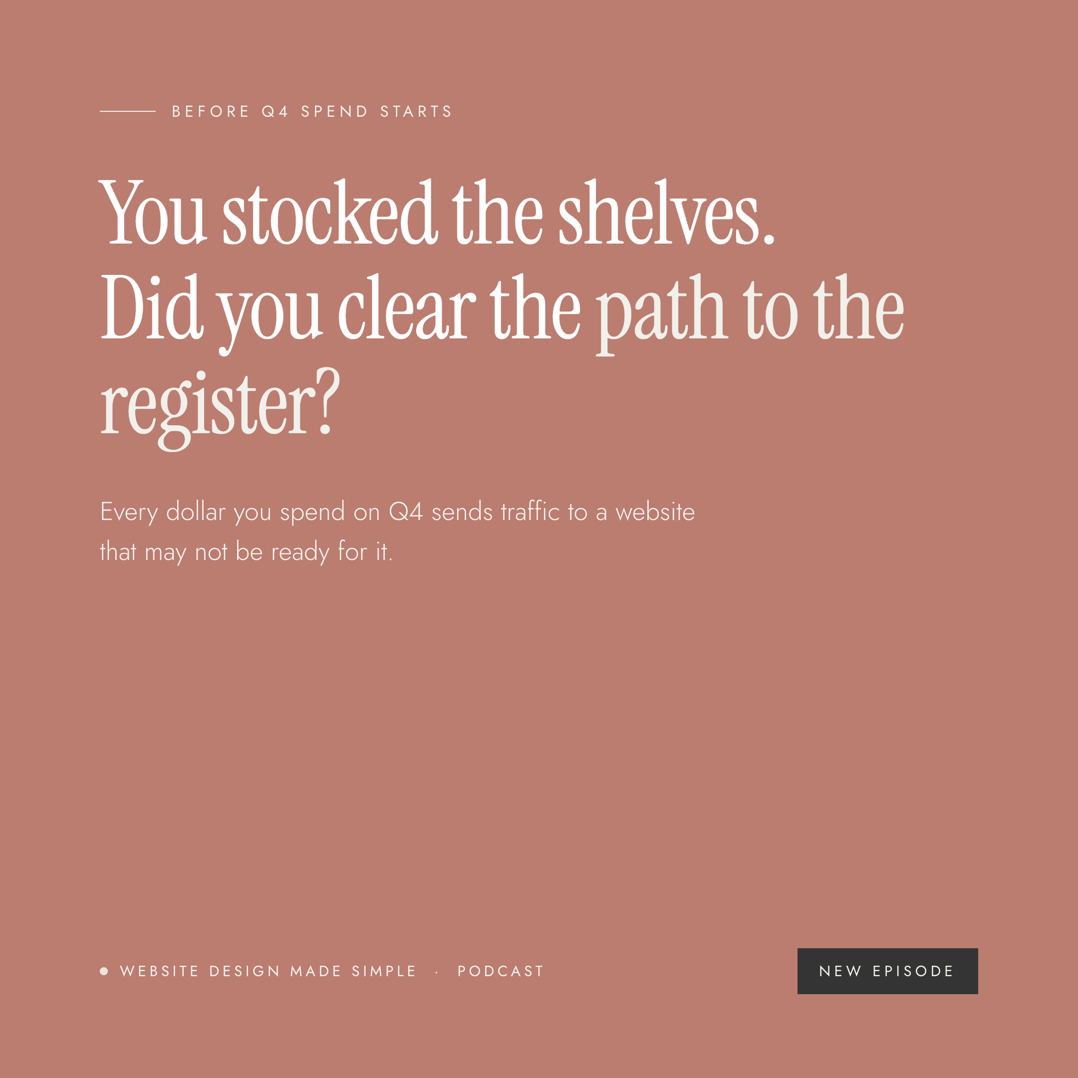
Think about a physical store getting ready for a big sale. You wouldn’t just put an ad in the paper and call it done. You’d walk the aisles, clear the path to the register, and make sure people know exactly where to go. Your website needs the same thing.
Walk through your own site as a first time visitor who just found you through an ad, a referral, or someone you met networking last week. How many steps does it take before they land on an actual scheduled call? I like it in three clicks or less. Every extra click, every unclear button, every moment someone has to stop and think creates a chance to lose them. Not because they weren’t interested, but because the path got harder than it needed to be.
This shows up in a few common ways. A booking button might only appear after scrolling through three sections of homepage copy, when it should be visible in the upper right corner from the start. A contact form might ask for ten fields before anyone can even see your calendar. Or someone fills out the form, hits send, and gets nothing back. No confirmation page, no note about when they’ll hear from you.
None of this is about adding more tools to your tech stack. It’s about removing friction. Sometimes the fix is as simple as moving your booking link higher on the page or cutting a form field you don’t actually need before that first call. This kind of walk through connects directly to your customer journey, and it’s worth mapping out at least once a year.
Does Your Homepage Reflect Who You Are Right Now?
Not who you were a year ago. Not who you were when you built the site. Who you are right now, heading into this fall. Businesses grow and shift more than we usually give ourselves credit for. Maybe you used to say yes to anyone who wanted to work with you, and now you know exactly who you do your best work with. Maybe you’ve gotten more confident about a specific problem you solve, or you’re solving a different problem altogether.
Read your homepage out loud like you’re describing your business to someone at a networking event today. Does it mention the clients you want more of, or the ones you used to work with? Are you describing the business you have right now, or the one you had when this website was built? If it’s the latter, this is exactly the kind of gap covered in signs it’s time to update your website, and it’s worth taking seriously before your fall marketing sends more traffic its way.
Why This Matters Even More Heading Into Q4
If you’re doing all the work of marketing this fall, whether that’s paid ads or simply showing up and networking more, but your website is attracting the wrong fit clients or losing people to friction, that effort works against itself. You end up spending more time and money to bring in the exact traffic your site was never built to convert. This is one of the quiet website goals that silently kill sales, and it’s often invisible until you go looking for it.
It’s also one of the most common reasons a website isn’t making money, even when the business behind it is doing well. The good news is that none of these three checks require a redesign. They just require a first time visitor’s eyes.
A Simple Way to See Your Website Like a Stranger Would
I know it’s hard to look at your own site with fresh eyes when you know every page by heart. That’s exactly why I built a free homepage clarity check bot, trained to look at homepages the way I do, but with the added benefit of an outside perspective. It’s one of the fastest ways to run a quick website audit without overthinking it.
If you want something more guided, I turned my workshop, Stop Guessing: Audit Your Homepage with AI, into a $27 on-demand resource. It gives you six ready to use prompts, one for each section of your homepage, plus a wrap up prompt that turns everything into a prioritized action plan. You’ll walk away knowing exactly what to fix now and what can wait a few weeks.
Before You Spend Another Dollar This Fall
Before you invest more time or money getting people to your website this fall, it’s worth twenty minutes making sure it’s ready for them. Check your calls to action. Walk your booking flow. Take an honest look at your homepage and make sure it sounds like the business you’re running right now, not the one you had a year ago.
A proper website audit doesn’t need to be complicated, and it doesn’t need to happen only once a year. Think of it the same way you’d think about a spring clean for your website, just for fall instead. And if you go through this and realize the gaps run deeper than a few buttons and a homepage line, that might be a sign it’s time for a new website entirely.
If you’d rather have a second set of eyes on it, I’d love to help. You can look through my website design services or grab a spot on my calendar through my contact page to talk through what a fall website audit might turn up for your business.