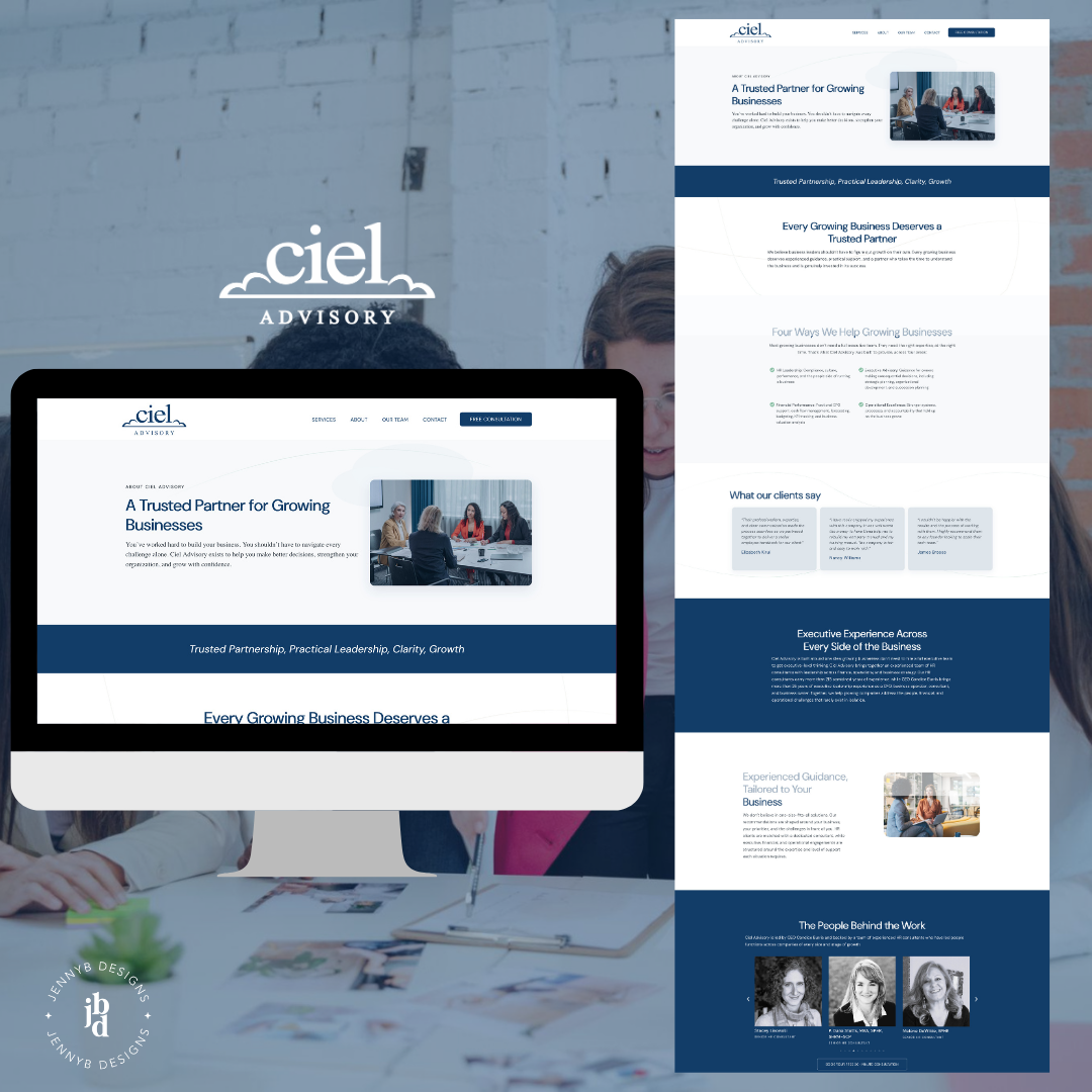
Some websites are designed around a visual concept. Ciel Advisory’s website was designed around a name.
Ciel is French for sky. For clouds. Candice Burris, the firm’s founder and CEO, named her HR advisory firm after her daughter, and that one decision handed us the design direction before we ever opened a browser tab.
In this post, I’m walking through how the HR website design came together. the visual choices we made, how the site was built around a single conversion goal, and what makes this approach work for firms selling expertise and relationships rather than products.
Who Ciel Advisory Is
Candice built Ciel Advisory around a premise that most growing business owners eventually feel acutely, you need senior-level HR and executive leadership long before you can afford to hire that talent full-time. Her firm steps in as a fractional partner, giving clients access to a team with 215 combined years of experience, without the overhead of putting that expertise on payroll.
The firm covers four areas: HR leadership (compliance, culture, performance management, talent retention), executive advisory (strategic planning, organizational development, succession planning), financial performance (fractional CFO work, cash flow management, forecasting and budgeting), and operational excellence (systems, processes, organizational structure). Month-to-month engagements, no long-term contracts, customized pricing for each client’s situation.
The copywriting came from Barb Davids of Compass Digital Strategy, who is also Ciel’s ongoing content and SEO strategist. Walking into a project where the copy is already clear, grounded, and written by someone who understands both the client and the search landscape makes the design work 100 times better. When words are doing their job, the visuals don’t have to compensate.
The Name Did Half the Work
In most HR website design projects, the brand story doesn’t translate directly into a visual language. There’s usually a gap between what the name means and what the site looks like. With Ciel, there was no gap and that was what made it so fun.
The name means sky. Clouds. Lightness and clarity and something that stretches wide. For the image selection, I looked for photography that carried that same quality, soft, layered cloud imagery, light catching atmosphere, real visual breathing room. Abstract lines that felt both organic and precise and a palette that reads as airy without losing the authority a firm like this one needs to project.
The result is a website that feels genuinely calm to look at. And for an HR consulting firm, calm is a strategic choice, not just an aesthetic one. The clients Ciel is reaching are typically business owners navigating a complicated season: an overstretched team, an unclear structure, a scaling problem they haven’t solved yet. When they land on the site, they shouldn’t feel like they’ve walked into another high-pressure pitch. They should feel like they’ve found someone who can help them think clearly.
That’s what the visual direction was designed to do. And because the name gave us such a specific starting point, the design was able to build on something real rather than invent something generic.

One Goal, One Clear Path
Everything on the site was built around a single conversion goal: book a free 30-minute consultation.
Not “explore the services” (though the services page is there and it’s substantive). Not “read the team bios” (though those bios build real trust). The whole arc of the site, from the first sentence of copy to the last button, was oriented toward getting someone onto a call with Candice or a member of her team.
This is how HR website design should work for a firm that sells relationships, not products. The sale doesn’t happen on the website. The website’s job is to get the right person into a conversation, and to make them confident enough to take that step. Every other piece of the site, the service descriptions, the team credentials, the thought leadership blog, exists in service of that one moment.
When I’m working through the layout and page hierarchy, that kind of focused goal matters. It’s the difference between a site that makes a good impression and a site that actually books consultations.
The Blog as Long-Term Trust Architecture
One of the things I appreciate about how Barb and Candice built out the content side of this project is the blog. It’s not decorative. It’s doing structural work for the site’s long-term authority.
The posts cover topics like workforce flexibility, managing Gen Z employees, and practical employee engagement strategies. These are the questions Ciel’s ideal clients are already searching for. When a business owner finds an article on how to retain employees and traces it back to a fractional HR firm with a credentialed team and a free consultation offer, the path to booking is short.
This is smart content strategy built into the site from the start, not retrofitted later. Barb’s work here gives Ciel a way to keep showing up in search, building authority, and earning trust with people who are still in research mode. It’s one of the best long-term investments a professional services website can make.
What This Project Gets Right
A few things stand out here that are worth naming clearly, because they apply to more than just this project.
When the brand has a story, the design has a foundation. Ciel’s name gave us a visual direction that was specific, meaningful, and impossible to replicate for a generic firm. That kind of clarity doesn’t happen by accident, and when it exists, the design gets to build on it rather than invent around it.
When copy and design are developed in conversation with each other, the site is more coherent. Barb’s writing gave the layout room to breathe. The calls to action felt earned rather than appended. The hierarchy made sense because the words were doing their part.
And when the site has one job, it does that job well. Focused HR website design isn’t about packing in every credential, service, and feature the firm has to offer. It’s about creating a clear path from “I found this site” to “I booked a call.” Ciel’s site does that, and it does it without feeling pushy or cluttered.
If Your Website Needs That Kind of Clarity
Most websites aren’t this focused, and that’s usually not a strategy problem. It’s a clarity problem. When you’re not sure exactly what your site should be doing, it ends up trying to do everything, and doing none of it particularly well.
If that resonates, a good starting point is your homepage. Run it through the Homepage Clarity Check and see what comes back, or take a look at the website audit if you want a deeper read. And if you’re ready to talk through what your site is and isn’t doing, let’s have a conversation. Getting clear on the job your website is supposed to do changes everything that comes after it. You can get there.