Website Design For Business Strategist — Case Study Walk-Thru
I would like to share a case study on one of my recent projects. Kim Dawson, Website Design for Business Strategist. Together, we created a cohesive visual brand. Her new website design now attracts her ideal clients and showcases her as the expert.
Why did Kim come to JennyB Designs for a website redesign?
Kim came to JennyB Designs because she wanted a website that attracted her ideal client. One that reflected the high quality services she delivers to high quality clients. She wanted to make sure that when she sends someone to her website, they will be able to instantly understand who she is, what she does and how she helps them.
Website Design For Business Strategist
What was wrong with her previous website?
She felt that her prior website was really simple. It had a lot of copy with blocks and blocks of text. It didn’t have very many visuals and it absolutely did not truly reflect the brand or showcase herself as the expert that she is.
What were Kim Dawson’s website goals?
Kim’s goal for this website was to come up with a cohesive look and feel that emulated through every single piece of her business and culminated online with her website. And of course, to attract more of her ideal clients in a streamlined fashion.
Let’s walk through Kim Dawson’s Website Design For Business Strategist
https://youtu.be/cX5-yth5reI
I’m going to take you through her website and show you the most important pages and what we did on each page to help her clients see her expertise, understand that she is who they need to work with and how to make that happen.
We’ll start on the homepage, where you’ll see her new visual brand. This is a very beautiful elegant, simple streamlined brand with just a few colors of pops in earthy tones. When you land on the website, above the fold, front and center it says “Living the Life You Want by Making the Money You Need in Your Business, real business strategy without the BS. It’s super clear who she is, what she does, how she helps. And there’s a call to action. Let’s work.
Very clean navigation up at the top with her main pages and her call to action book, a call. If you scroll through the homepage, you’ll see that we have very powerful headers throughout with short, concise copy underneath using her accent script to add a little bit of flare and personality. But again, it’s very clean, simple, and clearly driving people through the process to meet with Kim.
Throughout you’ll see the photos she had taken during a recent brand shoot. Which, as a web designer, I can’t highly encourage enough. Her photos are beautiful, forward facing photos of her in action wearing her brand colors — very simple, classy, and elegant.
We talk about ways that she can help solve your pain points and then testimonials with social proof on a homepage. It is essential that the homepage has social proof as people feel comfort knowing that someone else has found success in something that they’re looking to. Having testimonials on your homepage and with a photo or a video is a wonderful way to build that credibility with your audience.
Kim hosts a podcast and we wanted to showcase that right on the home front and center. And then her irresistible freebie — this is another one of the things that I find really important to help make someone’s website work for them, 24/7. She has a free five step pricing guide so people can kind of get to know her and build that know like, and trust factor so eventually one day she can make an offer that solves a problem they are experiencing.
And finally, down at the bottom of the page, the end of client journey, there’s the call to action button right at the bottom. And it takes them to the services page where they can learn more about her services and book a call.
Her about page is a very important page for service providers. This is clear and simple and talks about her, but more importantly, how she, specially, is the right fit to help her clients. It’s really all about the client at the end of the day. Continuing with her brand photos, nice clean look, and feel driving people to work with her and talking about how her clients get real. Talking about her, her podcast, and then again, more with the social proof and of course leaving everyone at the bottom of the page with that call to action.
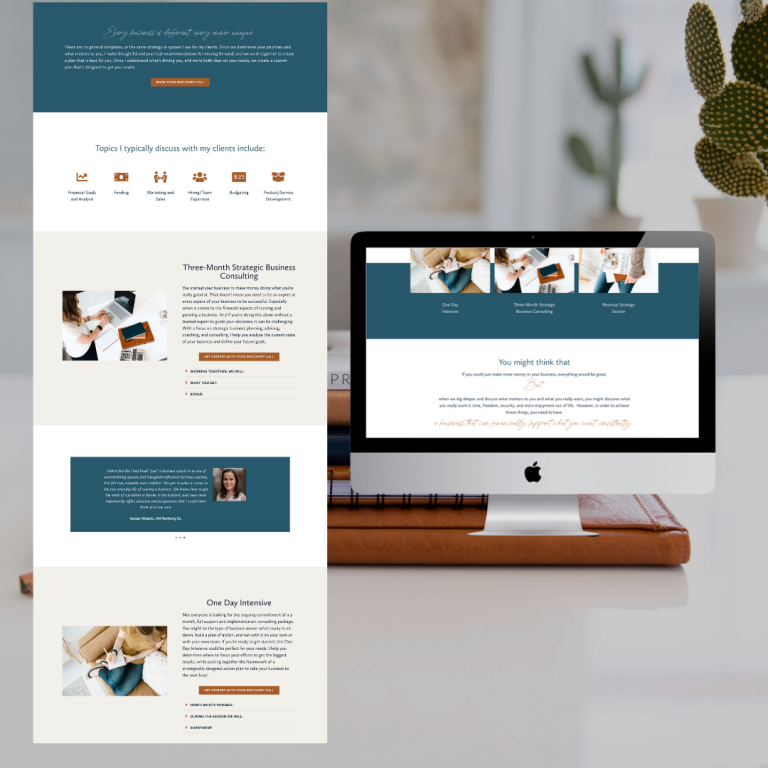
Kim’s Service Page as a Website Design For Business Strategist
This page, the services page, is really where we want to go in depth and talk about how you can help someone solve their problem. And these are the ways that you can work with Kim, which we have in a nice visual format with graphics. We have a little bit of copy and then talk about the ways that she can help. With the call to action, to book a chat, because the whole point of her website is to book consultation calls so that she can in turn, turn someone into a client.
And again, it talks a little bit about the topics to discuss, where we like to use imagery to visually represent some of the services she offers. But of course, blending in with her classic, simple, elegant brand. We talk more about the ways that she can work together with even more (yes!) testimonials and then at the bottom, there’s that call to action, make more now. The entire goal of the website.
Finally let’s hold on over to her contact page. This is where she wants people to be able to book a call, to get into that top of the funnel. But she also wants people to be able to send a message because there are other things that people might want to contact her about versus scheduling a consultation call. Again, very nice, clean, simple, and crisp.
Finally, a nod to her navigation. It’s simple and really important to be that way. I always encourage service providers to be five and under if possible, really drive people on that client journey.
From “just okay” to “classic, strategic, and crisp”
After working together, we developed a beautiful, clean, crisp brand for Kim. Her online presence truly reflects her as the expert that she is. And it shares her goal of helping you make more money in your business.
Need more help?
Looking for some more ways to make more money with your website’s home page? Grab my secrets, here.
And if you’re looking for a website redesign or a refresh, pop over to my contact page and share some more information about your project. I’d love to help!
Tune in each week for simple website design and optimization tips that will help you make your website work better for you. In each episode, you will discover actionable steps to create your money making website, grow your online presence and scale your business…because you shouldn’t have to work more to earn more in your business.
Hi, I’m Jenny, the designer behind JennyB Designs. List-maker by nature, mother by life, and a firm believer that you don’t have to work more hours to build a successful business.
For over 13 years, I’ve been helping business owners create websites that do real work behind the scenes. With the right structure, strategy, and design, a website can support growth, attract the right people, and quietly do the heavy lifting day after day.
Clients often describe working together as calm, organized, and supportive. The focus is always on partnership and clarity, because when the process feels steady, the end result feels even better.
The real win isn’t just hearing “this looks great.” It’s hearing “I finally feel confident sharing my website.”
A website should support your business, not demand more from you.