When Jaime P Bradley reached out, she had a clear sense of her voice as a writer. Her romance novels are fun, flirty, and full of characters readers fall for fast. What she did not yet have was a romance author website design that matched any of that.
Her existing site was functional, but it was not doing the work a website should do for an author. It was not pulling readers in, building connection, or making it easy for someone who stumbled across her books to take the next step. For a writer whose whole brand is built on emotional pull and irresistible storytelling, that gap mattered.
Website design services is built around one core belief: your website should work for your business around the clock, even when you are deep in a manuscript and nowhere near your inbox. For a romance author, that means a site that feels like an extension of your writing world and quietly does the work of converting curious visitors into devoted readers.
That is exactly what we built for Jaime.
What Romance Author Website Design Actually Needs to Do
Romance readers are loyal. When they find an author whose books feel like they were written just for them, they come back again and again. They sign up for newsletters, pre-order new releases, and tell their friends. The challenge is getting them to that point of connection in the first place, and that is where romance author website design either earns its keep or falls flat.
A romance author’s website has to do a few things well. It has to feel like the books. The tone, the colors, the imagery, the words on the page should all signal to a visitor within seconds whether this author’s world is one they want to live in. If someone picks up a fun, flirty beach read and then lands on a cold, generic website, that disconnect is doing real damage to what could have been a long-term reader relationship.
It also has to make the next step obvious. Buy the book. Sign up for the newsletter. Find out what is coming next. Romance readers want to stay close to the authors they love, and a well-designed author site gives them an easy, natural way to do that.
What I have found working with authors and service-based businesses alike is that the sites doing the most work are the ones built around the reader’s experience, not just a list of what the author has published. That distinction shaped everything about how we approached Jaime’s site.
The Challenge
Jaime’s previous site was not reflecting the quality or the energy of her books. It was not doing anything wrong exactly, it was simply not doing enough. For a romance author building a readership, a site that blends into the background is a missed opportunity every single day.
Here is what tends to happen with author websites that were built quickly or put together without a clear strategy. The homepage lists books. There might be a short bio. There might be a contact form. But the feeling that pulls a reader into one of Jaime’s novels, that warmth, that sense of fun, that promise of a happily-ever-after? That was nowhere on her site.
Romance readers make emotional decisions. They are not researching their next book the way someone might research a software purchase. They are drawn in. They are browsing. They are looking for something that feels right. A romance author website design that does not tap into that emotional pull is leaving readers at the door rather than inviting them in.
Jaime knew her site needed to catch up to where her writing had taken her. She had developed a clear visual identity through her book covers, a warm and recognizable palette, specific fonts that felt distinctly hers. None of that was living on her website yet. The site and the books were not speaking the same language, and readers landing on the site after discovering her books had no way of knowing they had arrived somewhere that was truly hers.
The Strategy
Before any design decisions were made, the first question was straightforward: what does a new visitor need to feel, understand, and do when they land on this site?
For Jaime, the answer was clear. A new visitor needed to feel immediately at home in her world. They needed to understand within seconds what kind of romance she writes and who her books are for. And they needed an obvious, low-pressure way to take the next step, whether that was buying a book, signing up for her newsletter, or simply exploring what she had already published.
I approach romance author website design the same way I approach all of my projects, as a list of smaller problems to solve in the right order. What goes in the hero section and why. How the navigation is structured so a first-time visitor does not have to work to find what they need. Where the newsletter signup lives and how it is framed so it feels like an invitation rather than an interruption.
One of the most important early decisions was to pull directly from Jaime’s existing book covers. Her covers had already done the work of establishing a visual identity. They had specific fonts, a warm and playful color palette, and a tone that was immediately recognizable as hers. The romance author website design needed to extend that identity onto the site rather than starting from scratch with something unrelated.
We also built in what I think of as a secondary engagement path. Not every visitor who lands on a romance author’s website is ready to buy a book on the spot. Some are browsing. Some discovered her from a recommendation and want to get a feel for who she is before committing. A smart author website design gives those visitors somewhere to go. For Jaime, that meant a bonus content page with exclusive material tied to her existing books, a genuine lead magnet that rewards curious readers without asking for anything more than an email address.
That kind of layered approach to engagement is something I come back to across all my projects. A website that only converts ready-to-buy visitors is leaving a significant portion of its traffic behind. When you build a path for the not-quite-yet visitor too, you are growing a readership rather than just processing one-time sales.
A Visual World That Matches the Books
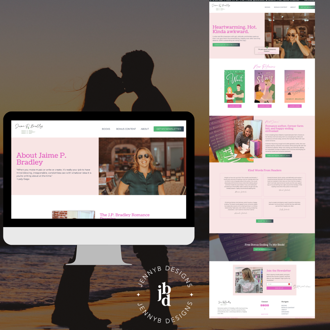
The foundation of Jaime’s romance author website design was brand consistency. We pulled the fonts directly from her book covers and carried her color palette through every page of the site. This was not a purely aesthetic decision. When a reader discovers Jaime through one of her books and then visits her site, that immediate visual recognition tells them they are in the right place. The site and the books feel like they belong to the same world, because they do.
We added a playful accent font that carried the fun, flirty energy of her writing throughout the site without overusing it. Every typographic choice was intentional, because in romance author website design, the feeling of the text on the page matters almost as much as the words themselves.
A Homepage That Does the Work
The homepage hero leads with Jaime’s latest release alongside messaging that speaks directly to the kind of reader she writes for. A visitor landing on that page knows immediately what they have found. The navigation is clean and simple, no buried menus, no confusing structure. A reader can find her books, learn about her, or sign up for her newsletter in seconds.
We placed reader testimonials on the homepage as social proof, which matters enormously in romance author website design. Readers trust other readers. A short, genuine quote from someone who loved a book does more conversion work than almost anything else on the page.
A Lead Magnet That Feels Like a Gift
The bonus content page is one of my favorite elements of this project. Jaime created exclusive bonus endings for two of her books, additional content that readers who loved the story would genuinely want. Accessing that content means signing up for her newsletter, but it never feels like a trade. It feels like getting something extra from an author you already like. That is the difference between a lead magnet that works and one that feels like a barrier.
Clear Pathways to Buy
The shop page is organized so that browsing feels natural. Book descriptions speak to the reader rather than summarizing the plot in a way that could belong to any book. The calls to action at key points throughout the site guide visitors toward buying without ever feeling like a push.
The Result
Jaime’s site is now doing what a romance author website design should do. It reflects the care and craft she puts into her books. It pulls readers in rather than presenting information at arm’s length. And it gives every kind of visitor, the ready-to-buy reader and the curious browser alike, a clear and welcoming next step.
The homepage no longer sits quietly in the background. It is the central hub of her author platform, a place where her readership can stay connected, discover new books, and feel like they are part of something she is building. Her email list is growing through the bonus content offer, which means she has a direct line to her most engaged readers that does not depend on any algorithm.
The shift from a site that was simply present to a site that is actively working for her is the kind of result I love most in this work. Jaime did not need to change what she writes or how she shows up for her readers. She just needed a site that was finally keeping up with her.
What This Means for Your Romance Author Website Design
Whether you are publishing your first book or your fifteenth, a few things tend to hold romance author website design back from doing the work it should be doing.
The first is disconnection between the books and the site. Your covers have already established a visual identity. Your writing has a voice. Your author website design should extend both of those things rather than starting fresh with something generic. When a reader moves from your book to your website and the two feel unrelated, you lose the momentum that brought them there in the first place.
The second is treating the homepage like a bibliography. A list of books with buy links is not a homepage strategy. It is a starting point. The readers who become devoted fans are the ones who feel a connection to you as an author, not just to one title. Your homepage is where that connection begins, and romance author website design that leads with personality and warmth builds that connection faster than one that leads with a catalog.
The third is missing the not-quite-yet reader. If the only path on your site is buy now, you are not giving hesitant visitors anywhere to go. A newsletter with genuine value, an exclusive bonus for existing readers, a behind-the-scenes look at your writing life, any of these gives a curious visitor a reason to stay connected even if they are not ready to buy today. Those readers often become your most loyal ones.
If you are wondering whether your own author website is doing this well, the Homepage Clarity Check Bot was made for exactly this moment. It looks at your homepage and tells you clearly what is working and what is quietly getting in the way. It is free and takes about two minutes. Grab it here.
Romance Author Website Design Built Around Your Readers
Your website should feel like an extension of your books, warm, inviting, and impossible to leave without wanting more. If your current site is not doing that, you do not have to keep working around it.
I would love to talk about what a site that truly reflects your writing world could look like. Let’s start a conversation.