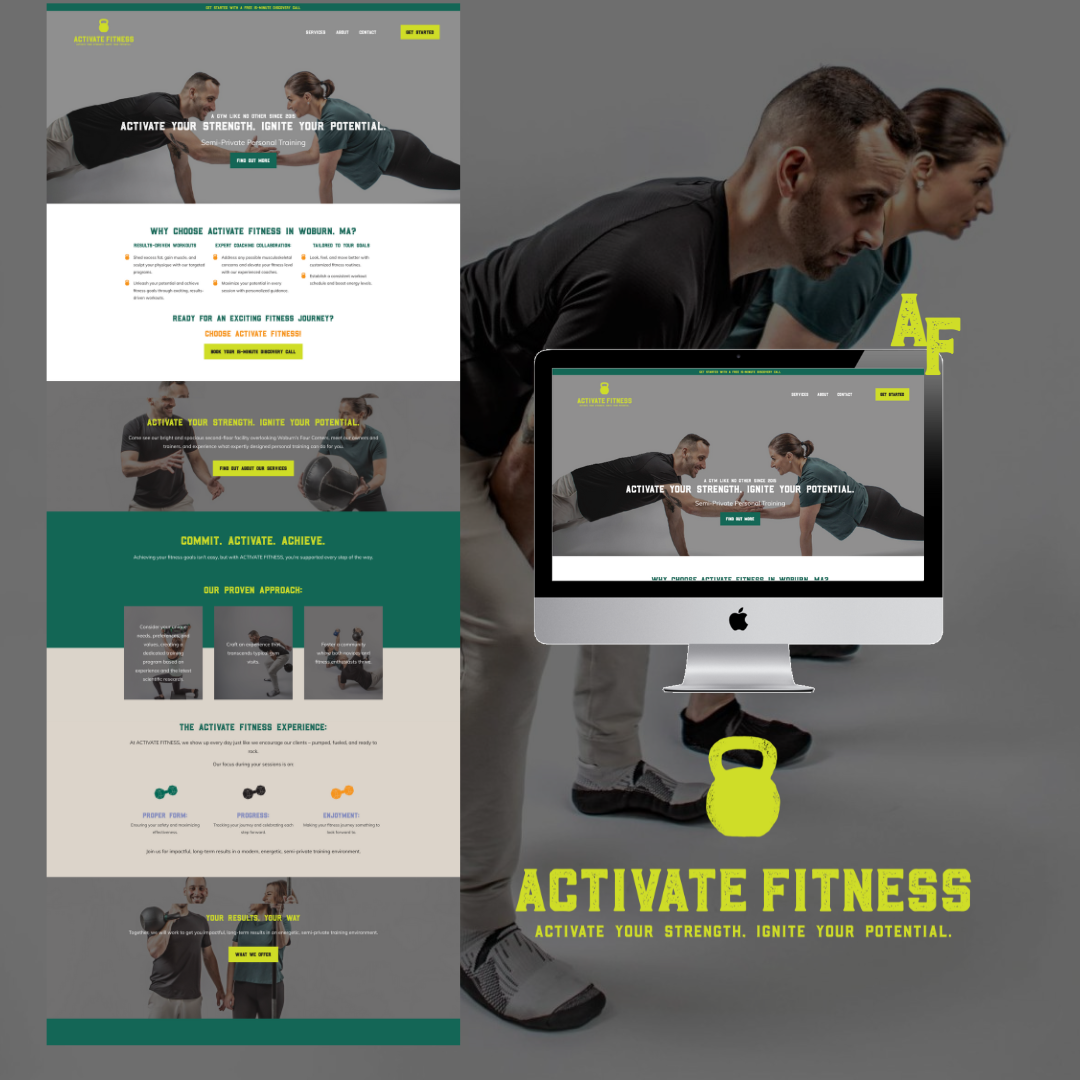
Recently, I had the opportunity to work with Julie and Daniel from Activate Fitness, a world-class semi-private fitness training facility in Woburn, Massachusetts. Julie came to me looking for an updated brand, logos, colors, and fonts that would accurately reflect her unique company and a website that would showcase her upscale services. Plus she also wanted collaterals for redesigning the interior of her expanded space.
Table of Contents
Toggle
Creating a New Brand for Activate Fitness
One of the first steps in this project was to create a new brand for Activate Fitness. After discussing with Julie her vision and goals for her business, thanks to Monarch Collaborative, we developed a brand that was fun, vibrant, and visually represented her business. The new brand perfectly captured the essence of Activate Fitness and set the tone for the rest of the project.
Brand Development and Visual Representation
The new brand for Activate Fitness included a new logo, color scheme, and font selection. These elements were carefully chosen to accurately represent Julie and Daniel’s world-class training facility and their unique personality. The logo was designed to be eye-catching and memorable, with a fun and energetic feel. The color scheme was chosen to be vibrant and energetic, reflecting the high-energy atmosphere of Activate Fitness. And the font selection was modern and sleek, with a bit of strength, perfectly complementing the overall brand image.
Branded Photoshoot
To further enhance the brand’s visual representation, Julie + Daniel schedule a branded photoshoot and were used throughout the website, adding a personal touch and helping potential clients get a feel for the people behind the biz.
Website Design and Copywriting
With the brand development and visual representation in place, it was time to work on the website design and copywriting. The website needed to accurately reflect the brand and showcase the upscale services offered by Activate Fitness. Using the new brand elements and branded photos, we created a website that was ultra-fun and represented the high-class training facility.
In addition to the design, That’s a Spade wrote new copy for the website that reflected Julie + Daniel’s unique personality and the high-quality services offered at Activate Fitness. The copy was informative, engaging, and encouraged potential clients to book a 15-minute discovery call to learn more about the programs offered by Activate Fitness.

The Result: An Ultra-Fun and High-Class Website
The end result of this project was an ultra-fun and high-class website that perfectly captured the essence of Activate Fitness. Julie and Daniel were thrilled with the new brand, website design, and copy. They felt that it accurately represented her business and would attract the right clients. And they was right!
In Conclusion
Working with Julie and Daniel from Activate Fitness was a wonderful experience. I am proud to have helped them elevate their brand and create a website that accurately reflects their business. The new brand, website design, and copy are a true representation of their world-class training facility and unique personality. If you are looking to elevate your brand and create a strong online presence, I would love to help. Get in touch today to get started on your website design project.


