
Client: Stillground Yoga + Wellness | Location: Southern New Hampshire | In partnership with Taylored Image
What This Yoga Studio Website Needed to Do
Some of my favorite projects start with a great brand already in place. Stillground Yoga + Wellness was exactly that kind of project.
I partnered with Lindsay of Taylored Image, a branding studio that had worked closely with founder Staci Hermann to develop a complete visual identity for her new yoga and wellness studio coming to the Southern New Hampshire area. Lindsay handled everything on the brand side, the logo, color palette, typography, stock imagery curation, and the website copy. She brought the full Stillground brand voice to life before a single page was built. My role was to take everything Lindsay and Staci had created and build a strategy-first website around it. One that was not only beautiful, but built to do real work for the business.
The Unique Challenge: Designing a Yoga Studio Website With No Physical Space Yet
Stillground doesn’t have a studio location yet. Staci is in the process of finding and securing her space. So the website’s first job wasn’t to drive class bookings or sell memberships, it was to build community, establish credibility, and grow an email list of people who are already invested before the first class is ever taught.
That’s a different kind of challenge, and it requires thinking carefully about what every page is actually doing for the business right now. Nothing on the site should work against that goal. This kind of pre-launch strategy is something I think about with every client.
How Great Branding Makes a Yoga Website Design Easier and Better
Because Lindsay’s work at Taylored Image was so well-executed, a big part of my job was translation. It was taking a visual identity that lived in a brand board and making it feel just as cohesive and intentional on a live website.
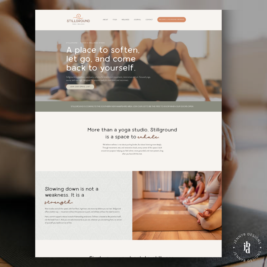
That meant a lot of attention to the details most visitors don’t consciously notice but definitely feel. Rounded edges on cards and image containers that echo the organic quality of the logo. The brand’s spiral mark used as a subtle background watermark, tying sections together without competing with the content. Generous whitespace and a restrained use of accent color that gives the site room to breathe , which is exactly the feeling Stillground is built around.
Lindsay curated a careful selection of stock photography to carry the site beautifully until Staci has images of her actual space, and Staci’s own personal photos are woven throughout as well. Getting those two to sit naturally together, so neither feels out of place, takes real intentionality in how you approach layout and image treatment. The copy Lindsay wrote is equally strong. Lines like “a space to exhale” and “slowing down is not a weakness, it is a strength” do exactly what great yoga website copy should do. They position the studio clearly and make you feel the difference before you’ve even looked at a class schedule.
The Strategy Behind This Pre-Launch Yoga Studio Website
The entire site is built around one goal at this stage: get people on the email list.
The homepage hero drives directly to a signup. A banner across the top of every page keeps the coming-soon message front and center. “Become a Founding Member” lives in the navigation on every page and is styled like an invitation rather than a sales push, which matters enormously for a wellness brand where trust is the whole foundation.
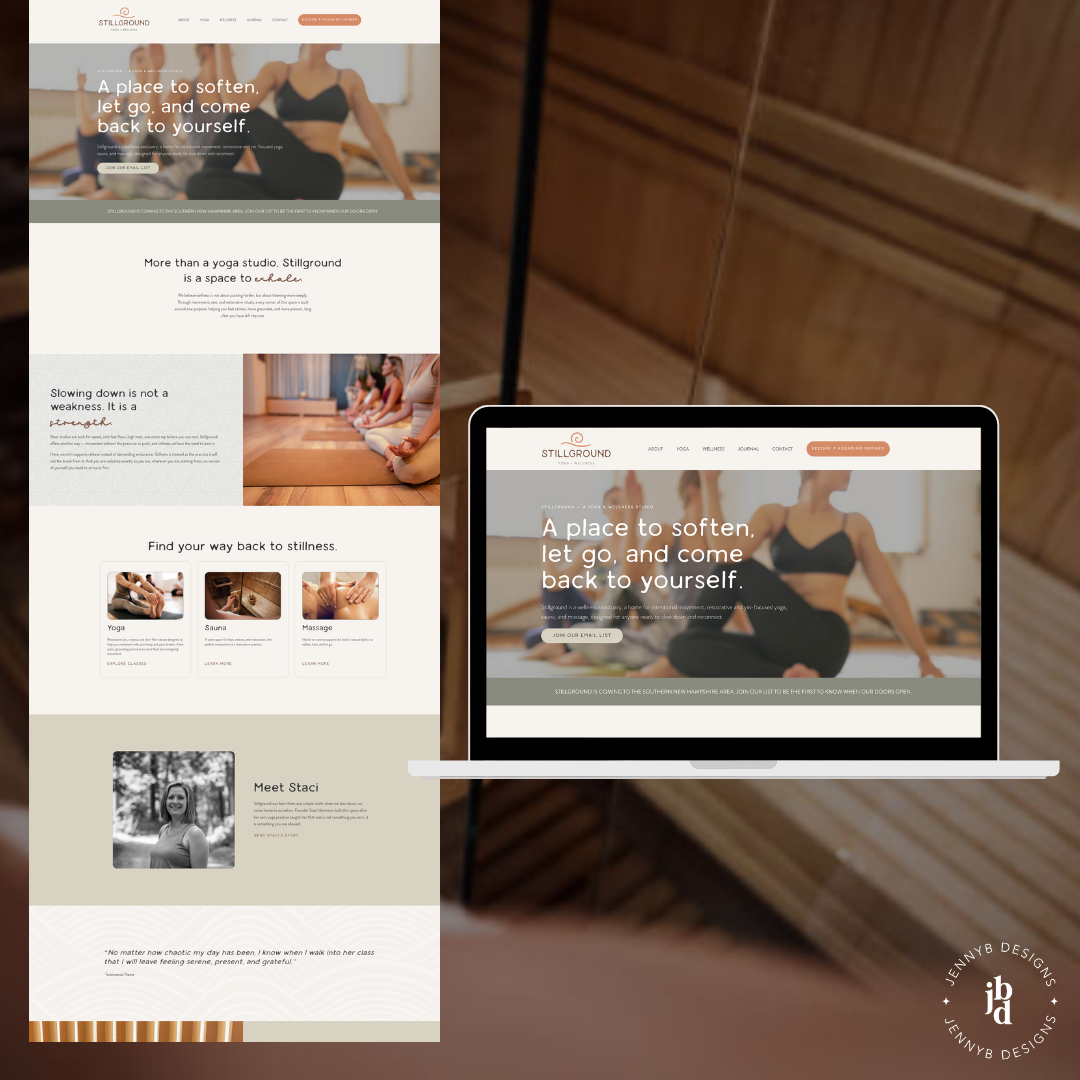
Service pages for yoga, massage, and sauna are fully built even though bookings aren’t open yet. That’s intentional. They give Google something meaningful to index now, they let potential clients picture what’s coming, and they make the business feel established even at the pre-launch stage. This is one of those things I recommend to almost every client launching a service-based business. You can see how I handle this kind of strategic website planning across all my projects.
Why Every Yoga Studio Website Needs a Blog
The Journal which is Stillground’s branded blog, is one of the most strategic elements on the site. Categories like Movement, Rest + Restore, and The Stillground Way give Staci a framework for building her point of view over time, establishing search visibility, and giving readers a reason to keep coming back. Posts naturally invite people to subscribe so they’ll hear about the opening first.
A yoga studio blog isn’t just content for content’s sake. Done right, it’s the engine that builds organic traffic, reinforces the brand voice, and warms up an audience long before you’re ready to sell anything. The same is true for any service-based business website and that’s something I talk about a lot in my own approach to small business web design.
What the Stillground Yoga Website Includes
The full site launched with a homepage, About / Meet Staci page, Yoga page, Wellness pages for both Massage and Sauna, a Journal with three post categories and branded templates, and a Contact page. The complete brand identity from Taylored Image, the watermark, the rounded design details, the full color and type system, is applied consistently across every page.
The Takeaway for Any New Yoga or Wellness Business
Your website can do real work for your business before you’re even ready to open. The key is building it with a clear strategy, a strong brand, and the right collaborators in your corner. When designers and brand strategists work together the way Lindsay and I did on this project, the result is a site that feels genuinely cohesive.
You can browse more of my client work here to see how I approach different industries and goals. And if you’re building or refreshing a wellness website and want a partner who thinks strategically about what your site actually needs to do, let’s talk.
In the meantime, if you’re in Southern New Hampshire and looking for a slower, more grounded approach to wellness, keep an eye on stillgroundwellness.com. Something wonderful is coming!
Website design and development by JennyB Designs. Brand identity, copy, and photography curation by Taylored Image